20.8.16

Planning Family Photos


I was watching Rudy play the other day and, for the first time, I kept thinking that she's starting to look more like a child than a baby.  Sometimes, it's a little hard for me to remember her at this time last year.  I'm glad when social media reminds me that she was crawling and getting ready to take her first steps while holding furniture.  Now she's an energetic toddler who runs and climbs and twirls and tries to somersault.  As I watched her play, I felt myself tearing up because I have loved every stage with her, but there are so many adorable and hilarious toddler mannerisms that I'm sure I'll have forgotten in a couple of years.

We are heading off to Western Canada shortly for a family vacation and I thought it would be the perfect place to have some professional family photos taken.  What better time in our lives to memorialize than when we're happy and relaxed on holiday?  Right now, Rudy is at this magical age where the world is a place to explore and she's still our baby but she's on the verge of being able to do so much!

Being a planner, I wanted to manage everything long before our trip and I agonized over choosing a photographer, locations and wardrobe.  I wanted our clothes to look great on us but not distract from the scenery and I wanted to be coordinated but not too matchy!

So how do you look coordinated and polished but not like your family uniform is jeans and black t-shirts?  You choose a basic colour palette with coordinating colours and start there.  They say that if colours are found together in nature, they'll work.  They don't all need to be from the same colour family, although I find that many shades of the same colour also look nice.

I used this site for my colour palette inspiration.  Some of my favourites are below.  I can't say I'm surprised by the number of photos containing succulents.  ;)


Our first outfits are mainly J. Crew with the exception of my dress (Gap) and Corey's Jeans (American Eagle).  Shopping at the same store when they have a new seasonal line out is a great way to find coordinating colours and fabrics.


We also wanted some casual clothes for the photo shoot.  We chose clothes that would be more reflective of how we dressed on a regular basis. We chose a palette of blue, teal and mint to compliment the lake and mountain backdrop of the photoshoot.  The photo below is terrible (it was taken hastily at night while we were packing) but I'm actually really excited about these outfits.


For more inspiration and tips, here are two great articles on the topic by other bloggers:

http://www.kristendukephotography.com/what-to-wear-in-family-portraits-2/

Chair Makeover


I love a good "Before and After" post and when my mom decided it was time to do something about her (comfortable but dated) wing-back chairs, I rushed over to snap a photo.


It was nice, but a little bland and I hoped she'd choose something contemporary like a modern floral pattern to punch it up!  I always love seeing large, bright floral prints in magazines.


I'd been eyeing this upholstery pattern on fabric.com for a long time.  I had hoped to use it to cover a chair but I never found the right chair.  I got really excited when my mother emailed me a link to the exact pattern I liked.


It's rare that we agree on this sort of thing and it sort of felt like kismet.  

Now her modern looking chairs are lovely seats for people (or cats) in her sun room.


It really makes me want to find a bright fabric for the bland (but comfy) couch in the family room.

9.8.16

Macramé Planter Workshop with The Sweet Escape


I have a crafty friend who joins me in taking workshops a couple of times a year.  It's always fun (sometimes boozy) and we love catching up while working on a craft.  I drag her all sorts of places and she's a very good sport so when the talented Melissa DiRenzo from The Sweet Escape offered a macramé workshop, we signed up immediately.

I had last attended one of Melissa's workshops while I was about eight months pregnant with Rudy but I had fond memories of it.  This one may have been even more fun and I've always wanted to learn how to make delightfully granny (and totally boho chic) hanging planters that are in style right now.

First of all, I have to share a couple of shots of Melissa's studio space because nearly every nook and cranny is creative, colourful and Pinterest-worthy!


Pretty, right?  Now let's get to the craft, which was pretty easy and only took a couple of hours from start to finish.  Another bonus was that, since Home Depot supplied everything we needed, I now know where to get more supplies!


We began with drapery hoops, some copper tubing, six equal (approximately 14 foot) lengths of cotton rope, scissors to cut and (optional) fabric dye to dye the ends.

We threaded the rope through the drapery hoop, creating twelve lengths of rope.  We then proceeded to divide them into three groups of four and we made the spiral top part using one basic knot.  It actually felt like making friendship bracelets at camp and the time flew by.  We were all encouraged to use our own ideas in terms of placement of the copper tubes etc.

As you can see from the four examples, there's really no wrong way to do it!

To make the diamond ropey part that holds the planter, you can just use the same knot twice (I actually used a square knot which is the original knot once and then, instead of tying the same knot again, you do it in reverse, which makes the knot flat instead of spiral.) to join the three different sections.


It's actually very intuitive once you start.  We finished by knotting them and some of us chose to dye the loose ends at the bottom.  Here's my finished product.


Cute, right?

2.8.16

New Office (Desk Before & After)


Late this spring, my office moved to a new building and I was honoured and touched when my manager offered me a beautiful office with a window view.  I have always worked mainly from home but I decided that having a beautiful and private space will be a nice change.

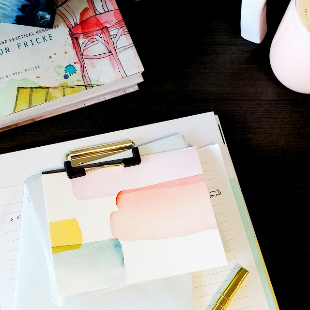
I made myself at home quickly by bringing in some books, stationary and my favourite teas.  Still, my desk felt a little cold and sterile so I decided to bring in some colour.


I chose a theme of peach and soft pinks, blue and turquoise with gold accents.  Corey teased me when I even found office supplies that were on theme.


I made sure to have some art, some interesting shapes, objects of different heights and textures but it was still feeling a little too contrived.


I needed plants!  Plants always make a space feel homey.  I have a south facing window so I'm hoping that even with the shade, I'll be able to keep some succulents alive.  I love this grouping!


This mini vase is my favourite!


The finished product is a space I'll look forward to spending time in.  What do you think?


Related Posts by Zemanta